Neck tattoos are bold. They grab attention and can change how people see you. I put this together because picking the right font for a neck tattoo is tougher than it looks. The neck is a tricky canvas—skin moves, ink ages, and the curve can twist a word into something unclear. I wanted to give you a clear starting point. So I pulled together 30 neck tattoo fonts that stand out, from smooth scripts to strong block styles, all ready for real skin.
Who is this for? If you care about style that speaks before you, this one’s for you. If legibility, placement, and how ink ages matter, you’ll find value here. This is for anyone planning a neck piece, for people who want a font that fits the curve and the mood they want. Designers and clients alike can use these options to start a real talk with a tattoo pro.
What you’ll get is clear. Here you’ll see 30 fonts that cover several vibes: clean sans, classic serif, ornate blackletter, and handwritten scripts. Each style is chosen for neck scale and legibility. You’ll also get notes on how to pick a font for curved skin and how line weight and spacing affect readability.
Practical tips to try help you move from idea to ink. Print at actual size, wrap a mock neck, and test under different light. See how the word shifts when you tilt your head or bend your neck. Ask your artist how the design will sit with the collar, hairline, and clothes. These steps help you see real results before you commit.
Be honest about limits. Fonts can look different on every person. A font that feels bold on paper can feel thin on a slender neck. This list is a helpful guide, not a final plan. Your tattoo artist will tailor the final shape to your skin and your style.
Ready to start? Save your favorites, compare scripts, and talk to a pro. With these options, you’ll get a better sense of what fits your vibe and what to test first. You’ll walk away confident in your choice and ready to make a small, bold mark that lasts.
1. Clean Sans-Serif

You want a neck tattoo that feels modern and easy to read. Clean sans-serif fonts give that look. They have straight lines and no extra curls. The result is sharp, simple, and bold.
This style fits minimalist neck tattoos. It keeps the focus on your message—your initials, a word, or a short phrase. The letters stay clear as your skin moves. It feels chic and timeless.
Tips to choose and place your font
– Opt for generous spacing so each letter breathes.
– Pick a size that follows the neck’s curves and looks balanced from a few steps away.
– Go monochrome—black or charcoal gray for high contrast and longevity.
– Consider weight: a medium or bold sans-serif often reads best in real life.
– Align with the natural lines of your neck, either along the throat edge or centered across the collarbone.
Practical steps to test before you ink
– Do a skin mockup with a makeup pencil or temporary stencil.
– Print a full-size mock on paper and hold it where the tattoo will sit.
– Get a second opinion from a clean layout you trust.
Take your time and pick a font you’ll still love in a year. That keeps your tattoo honest. Choose lasting appeal.


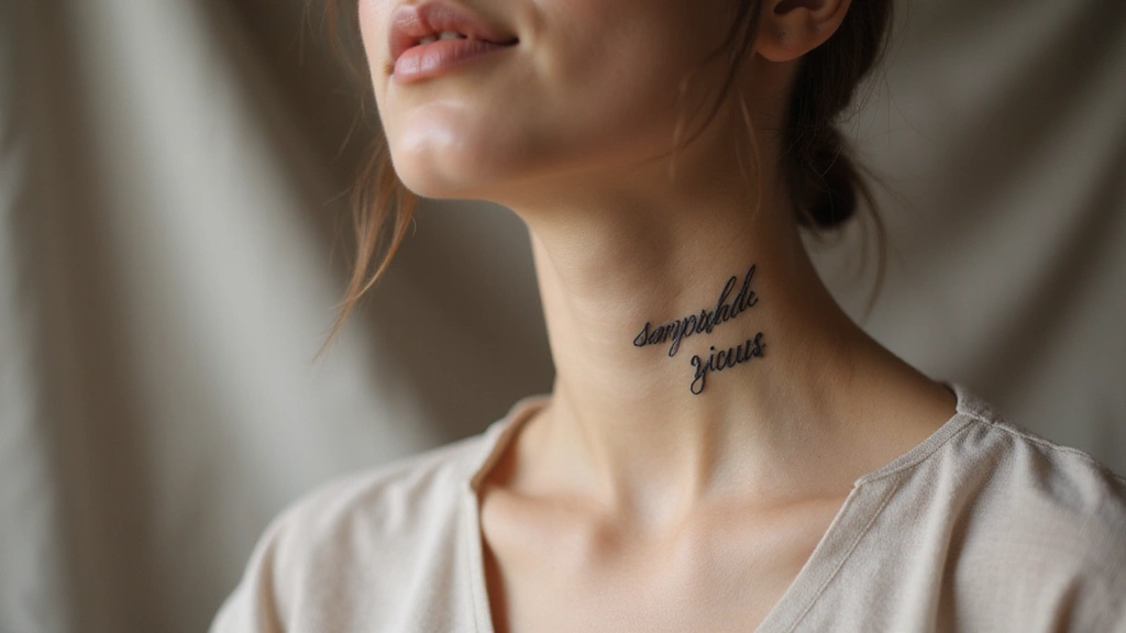
2. Elegant Script

If you want neck ink that feels soft and personal, elegant script gives you that grace. It flows like handwriting and can carry a personal message in a striking way.
What makes elegant script work on the neck
The neck’s curve guides every letter. Delicate lines run along the skin with ease. Small flourishes add charm without clutter.
– Look for flourishes that match your neck’s silhouette.
– Test legibility at the size you want; ornate letters can blur up close.
– Pair with light details like tiny flowers or hearts for balance.
How to choose and test
Start with your message. Then try two or three script fonts and print them at the size you plan. Hold the page to your neck to see flow. Play with spacing and height; adjust until it sits comfortably on your skin.
Placement tips
Move the text along natural lines—side of the neck or just under the jaw—for the cleanest look. Consider a vertical line or a short curve to follow your throat.
Trends and practical advice
Thin, airy scripts are popular right now. Minimal scripts stay readable longer. Classic black ink remains the most legible; a soft gray can soften the overall feel.
Ready to start? Gather two to three font samples, mock the words on paper, and bring them to your artist for final tweaks.
3. Bold Serif

Bold serif neck tattoos make a clear statement. They blend classic elegance with a modern edge. You get a look that feels strong and refined at the same time.
Bold serifs use thick strokes and sharp contrast. That contrast helps the letters stay readable on skin, even when light hits your neck. Choose a serif with clean lines and avoid overly curly decorations.
Practical guidance for inking
Font family choice changes the vibe. Didone and Bodoni give a dramatic, high-contrast effect that looks bold from far away. Garamond or Times offer a timeless feel that still reads clearly. Test your pick at the intended size with a dry run on paper or a stencil.
– Keep size in mind so letters read at arm’s length.
– Use solid black ink for best contrast; skip gray washes.
– Pair the text with minimal accents so the font stays the focus.
– Ask your artist to adjust tracking and spacing for the neck’s shape.
– Check placement on the neck’s curve and try layouts along both front and side.
– Plan for healing and touch-ups to keep the edges crisp.
Imagine COURAGE running across your collarbone, or FORTITUDE along the side of your neck. Short words tend to read better on curved skin and in small spaces. If you want a longer line, keep the message concise and let the serifs do the talking.
Bold serif is a strong choice when you want a sign of character. With careful sizing, smart color, and clean composition, it can look timeless.
4. Minimalist Geometric

If you want a neck tattoo that stays clean and modern, minimalist geometric fonts could be your best match. They turn letters into simple shapes—straight lines, sharp angles, and small circles. The result is readable, stylish, and not loud.
These designs feel calm yet bold. They guide the eye along your neck and sit nicely with natural curves. A geometric neck tattoo can carry ideas like balance, order, or clarity without shouting.
– Think about the neck’s shape. Curves can soften sharp angles for a smoother look.
– Play with spacing and alignment. A little air around letters keeps the design legible.
– Add other geometric elements slowly. A few shapes can make the piece feel cohesive and intentional.
If you’re unsure how it will sit on your skin, practice first. Sketch on paper, or use a photo app to lay out words in geometric letters. This helps you see size, spacing, and how it moves with your neck.
Practical steps to try
1) Create 3 quick font sketches using bold and thin lines for contrast.
2) Mock them up on your neck with a washable marker or a temporary tattoo.
3) Talk to your artist about line weight, spacing, and possible embellishments.
4) Start with a small, simple piece to test how you like the look over time.
Common questions often pop up. Can you mix shapes inside a single word? Yes, but keep it simple. Do thinner lines fade faster? Yes, plan for a slightly bolder line if you want longevity. With thought and clear goals, minimalist geometric fonts can give you a neck tattoo that feels fresh for years.
5. Vintage Typewriter

Are you after a neck tattoo that feels timeless and clear?
A vintage typewriter font gives old-world charm with a simple edge.
These fonts work for quotes or short lines that mean something.
The imperfect ink adds texture and a touch of history.
The texture helps the words stay readable on a curved neck.
Choose this style if you want a font that blends old and new.
Pick a quote with personal history or a strong belief.
Plan placement and size for easy reading on a curved neck.
This style suits people who want a readable mark that ages with them.
Tips for making it work
– Consider placement and size, because readability is key.
– Test the layout with a stencil to see how the text curves.
– Ask the artist for bolder lines so the letters stay clear as ink ages.
– Pair a simple flourish or initials to balance the look.
– Check ink density with your skin tone and neck movement.
– Think about maintenance and how the mark ages on your skin.
With the right choice, a vintage typewriter neck tattoo can feel like a page from your life.
Plan well, and you will wear your story with quiet confidence.
Your tattoo should tell your story, not shout it.
| Font Style | Description | Tips |
|---|---|---|
| Clean Sans-Serif | Modern and easy to read, sharp and simple. | Opt for generous spacing, monochrome colors, and align with neck’s natural lines. |
| Elegant Script | Soft and personal, flows like handwriting. | Test legibility, pair with light details, and follow natural lines. |
| Bold Serif | Strong and refined, blends classic elegance with modern edge. | Use solid black ink, keep size readable, and check placement. |
| Minimalist Geometric | Clean and modern, uses simple shapes. | Test alignment, add geometric elements slowly, and consider line weight. |
| Vintage Typewriter | Timeless and clear, adds texture and history. | Test layout with a stencil, consider bold lines for longevity. |
| Artistic Calligraphy | Elegant and personal, blends handwriting with tattoo ink. | Choose a font with clear rhythm, draft on paper, and discuss line weight. |
| Watercolor Fonts | Alive and artistic, colors blend and edges blur. | Pick a palette of 3-5 colors, plan flow along neck, and find a specialist artist. |


6. Artistic Calligraphy

You want a neck tattoo that feels like art and tells your story. Artistic calligraphy blends the grace of handwriting with tattoo ink. It uses flowing lines and careful flourishes, giving you a look that’s both personal and stylish.
Why choose artistic calligraphy
This style works with the neck’s curves. Thin lines feel elegant, and thicker strokes keep the word readable. It moves with your posture, so the design breathes when you sit, stand, or tilt your head.
Design ideas and tips
– Let the letters follow the neck from near the collarbone up toward the jawline, not against it.
– Pick a style that sounds like your voice, not just what’s popular.
– Add tiny touches like stars, leaves, or subtle dots to lift the design without crowding it.
Practical steps
– Choose a font with clear rhythm and legibility at the size you want.
– Draft on paper, then create a simple transfer for your skin.
– Schedule a consultation with a tattoo artist who specializes in fine lines and smooth connections.
– Discuss line weight, letter spacing, and how the letters connect along the neck.
Care and expectations
– Fine lines need careful aftercare.
– Healing takes a couple of weeks; avoid sun and heavy sweating.
– Use fragrance-free lotion once your artist says it’s okay.
7. Handwritten Script

A handwritten script tattoo feels personal and true to you. It mirrors your natural handwriting, giving warmth and realness. A script can carry a favorite phrase or personal mantra. It becomes a memory you wear.
To pick a handwritten neck design, start with the message and the vibe. Handwritten scripts work when they look like your letters and age with you. They stand out when the lines have space and rhythm.
– Match your handwriting — pick a script that resembles your own letters.
– Mind the size — larger letters stay readable on the neck; tiny letters blur.
– Flow with your neck — place the text to follow its curves.
– Test with mockups — write phrases on paper or use digital previews.
– Color and weight — choose bold ink or fine lines based on skin tone and wear.
When you plan, ask your artist for a few size and style samples. See how the script looks from different angles and in different lighting. Be realistic—handwritten neck scripts can be stylish, but care and proper placement keep them legible.
Today, loose, flowing scripts are popular on the neck. They read well in black or dark ink and work with casual fashion.
8. Modern Graffiti

Modern graffiti on the neck gives you a bold, urban look. If you want a tattoo that feels alive, this style works. It is loud, it is creative, and it says something unique about you. You can use color, shapes, and letter forms to tell your message.
To make this work, plan these points:
– Choose a graffiti font that stays readable on the skin.
– Pick a color scheme that fits your skin tone.
– Place the design along the neck’s natural lines.
– Add splashy color or abstract shapes to give motion.
– Keep the design scalable.
Work with a skilled tattoo artist. Bring examples of graffiti art you love. Ask for strong outlines first, then fill. Check that shading adds depth but stays legible from a distance. Discuss aftercare: clean, moisturize, and protect from sun.
This style makes a bold statement. It fits people who want a standout piece. With clear planning and a good artist, it can look great for years.
Think about how you move your neck every day. Ask the artist to do a small stencil test. Schedule a color touch-up later to keep it bright. Graffiti fonts for the neck work best when you keep things clean and confident.
9. Playful Doodles

If you want a neck tattoo that feels fun and friendly, playful doodle fonts are a solid choice. They bring whimsy without shouting, and they read clearly when inked in a simple line. You can express your bright personality while keeping the design easy to read up close.
Key steps for playful doodle neck tats
1) Choose a short phrase you love that fits on the neck.
2) Pair it with light doodle elements to match your vibe.
3) Mind the size and spacing so the letters stay legible.
4) Plan placement in a spot that feels personal, like the side of the neck or near the collarbone.
5) Decide on color or shading to keep the look crisp and fade-resistant.
A few practical tips to make it work in real life:
– Keep the lines thin and clean so the design stays readable over time.
– Test with a temporary stencil to see how the letters sit with your neck’s shape under natural light.
– Choose black or dark gray for the main lines; tiny color pops can be added after you’ve seen the base design.
Work with a tattoo artist who has experience with doodle lettering. Ask for a stencil first and view it from different angles and lighting. Realistic expectations help you plan for how the ink may soften a bit as skin ages, which is normal for fine lines.
10. Vintage Serif

Why vintage serif works on the neck
You want a neck tattoo that feels timeless. Vintage serif fonts bring charm and quiet elegance. They have solid, classic lines and gentle curves. The look ages gracefully.
Choosing the right era
Think about the mood you want. Victorian flourishes, clean early 1900s styles, or bold art deco shapes. Each era carries a vibe. Pick a phrase or a date that means something real to you. Short phrases usually work best on the neck.
How to get it right:
– Start with a simple phrase, 2-4 words or a single date.
– Sketch it on paper, then print a mockup. Check how it flows.
– Decide placement. Side of the neck or along the collarbone reads best.
– Choose stroke weight that fits your skin tone and how bold you want it.
– Add a tiny accent, like a dash, a dot, or a small initial, so the serif shines.
– Readability first: Keep letters clear from a distance; serif details stay crisp.
– Spacing matters: Adjust kerning to avoid crowding on narrow neck spaces.
– Ink choice: Black ink is bold; dark grey softens the look over time.
– Care helps: Aftercare protects the edges so the serifs stay sharp.
You’ll end with a classy, easy-to-read tattoo that tells a personal story.
11. Artistic Block Letters

If you want a neck tattoo that truly grabs attention, artistic block letters can do it. They feel strong and clean, easy to read up close or from far away. With a few personal twists, they become a bold centerpiece on your neck.
You can customize block letters with subtle flares, shadows, or a tight, tall form. Or go broader and heavier for a punch. A black-to-gray gradient or a hint of color at the edges adds a modern touch without hurting readability. Use the letters to frame a word, date, or motto.
Key considerations for this style
– Follow the neck’s contour so the letters sit flat as the skin moves.
– Choose size and spacing that stay readable as you age.
– Add embellishments sparingly to keep the main word clear and strong.
– Try gradients or a small color touch for a contemporary feel.
Placement matters. Center-front placement makes the message obvious; a side run along the neck line feels sleek. Keep line weight steady so edges stay sharp as you heal. Avoid crowded styles that blur when the skin moves.
Before ink, collect references and test with a stencil. Visit a skilled artist, review several font options, and ask for a neck mock-up. Check lighting and how the ink sits as you move your head.
Block letters work best when readability stays first. Choose a trusted artist and follow aftercare to keep edges crisp.
12. Romantic Cursive

If you want a neck tattoo that feels personal and soft, romantic cursive can help. Romantic cursive delivers elegance while staying readable. A neck tattoo in flowing script can carry a name, a word, or a short phrase with real meaning. The curves of the letters move with your skin, creating a gentle sense of motion as you walk or tilt your head.
Before you ink, plan how the line sits on your neck. Consider the neck’s curves and how the letters wrap around them. A well-chosen cursive reads clean from the front and from the side, and it ages well. Remember the emotional weight of the words you choose.
– Flow and wrap: let the letters follow your neck’s natural curves.
– Choose words with meaning: pick something that truly matters to you.
– Add decorations lightly: small hearts or vines can lift the mood without crowding the text.
– Size and spacing matter: test a few scales to keep the script readable from arm’s length.
– Placement ideas: behind the ear, along the neck’s side, or across the collarbone create different vibes.
Work with a skilled artist who can sketch the wrap and test the look.
Ask for a test design to see how the wrap sits and how each letter connects before you commit.
13. Chalkboard Style

If you want a neck tattoo that feels relaxed and friendly, chalkboard style could be a great fit for you.
It gives a handmade look with bold, easy-to-read letters.
This style shines with short quotes that lift your mood or share a quick message.
Texture and design
Choose a font that mimics chalk and surfaces that look dusty. The goal is a soft, imperfect edge, not a sharp print.
– Aim for a soft, dusty edge rather than sharp lines.
– Keep lines slightly imperfect for that chalk feel.
– Test readability from a few feet away.
Size and placement
Keep the line work slim and long along the neck so it stays readable without crowding the skin.
Background doodles
Add tiny doodles like stars, arrows, or swirls to reinforce the chalk vibe without stealing the show.
Color and ink
Use off-white or light gray tones to imitate chalk on a board. Gentle shading gives depth, while clean lines keep legibility.
Technique tips
Ask your artist to layer fine shading and subtle texture to create that dusty look. A few scattered specks or smudges can sell the chalk effect.
Care and longevity
Neck skin heals, so follow aftercare steps and keep the area moisturized. Protect the tattoo from strong sun to slow fading.
Choosing an artist
Pick a pro who already does chalkboard-style fonts. Review their chalkwork on similar projects before booking.
Maintenance
Chalk tattoos may fade a bit over time. Plan for light touch-ups to keep the quote crisp.
For reference, you might start with a short line like “breathe” or “stay curious” to test size and readability.
14. Futuristic Fonts

If you want a neck tattoo that feels like it’s from the future, a futuristic font can help. These fonts use clean lines, sharp angles, and simple shapes. They fit the curve of your neck and stay readable as you move. A future vibe shows you think ahead without saying a word. It’s bold, modern, and surprisingly easy to wear with the right design.
The best futuristic fonts stay clear on skin. Pick geometric sans or sci-fi styles with distinct edges. Avoid fonts with too many curls, as they blur when the skin moves. Test a few options on paper and on your upper arm or chest before committing. The neck is a small canvas, so choose a compact layout.
– Choose a font with crisp lines and obvious shapes for readability.
– Favor geometric sans or sci-fi styles for a modern, clean look.
– Decide between all caps for a bold vibe or mixed case for subtler feel.
– Tweak spacing so letters breathe and remain legible on skin.
– Consider ink options: black with neon accents or UV glow ink.
– Test the look under daylight and dim lighting to judge readability.
– Pair the font with abstract shapes or circuit lines.
– Plan placement and size for a neck-friendly fit.
15. Distressed Fonts

You want a neck tattoo that grabs attention and stays readable. Distressed fonts give a rugged, weathered look. They feel aged ink—rough edges, uneven strokes, a touch of wear. This style is bold and honest, great for words that carry weight.
Choosing a distressed font means finding balance. You want texture that adds character, not chaos. Consider your neck’s curve and skin tone. Pick a weight that remains legible when the neck moves or rests. Test from a distance; it reads clearly a few steps away.
Readability matters. A busy font can slow the eye. Test often.
– Keep letters legible. If lines blur, scale up a touch or choose clearer spacing.
– Add tiny accents. A star, an arrow, or a small dash can boost meaning without crowding.
– Think about aging. Distressed looks fade; you may want a stronger outline or thicker strokes.
Practical steps you can take:
– Print 2–3 options and place them along your neck. Use tape to test fit and flow.
– Try a mock with a temporary tattoo or transfer. Move your head and tilt to judge readability.
– Talk to your tattoo artist. Ask for crisp edges where the wear happens and steady shading to hold the texture.
Why it works: it feels current, energetic, and personal. With careful sizing and clean execution, you get a bold look that lasts.
Embrace the beauty of rugged elegance! Distressed fonts for neck tattoos add character and depth, making your words not just seen, but felt. Choose wisely, and let your ink tell your story.
16. Whimsical Brush Script

You want a neck tattoo that feels playful but still chic. A whimsical brush script can give you that. It looks like paint from a soft brush, with lively curves and movement.
This style works well for short uplifting phrases, names, or personal mantras. It turns your neck into a canvas of self-expression you can show or hide as you choose.
Practical tips for Whimsical Brush Script
– Legibility first: Choose letters with fluid flow but keep strokes a bit bolder so they stay readable on skin.
– Color and ink: Dark ink stays crisp longer; you can add a tiny accent color in a letter tail or a dot.
– Size and spacing: Start with a height around 1-1.5 cm per letter depending on neck area; keep close tracking but avoid crowding.
– Decorative elements: Add a small flourish such as a swash, a leaf, or a tiny star in moderation.
– Placement tips: Let the text curve with your neck and break into one or two lines if needed.
Care matters. Keep it moisturized during healing to avoid feathering.
Phrases like stay bold, be you, or a loved one’s name work along the side of the neck.
This style gives a lively, personal vibe with clean readability when planned.
Test a tiny mockup.
17. Simple Outline Fonts

Looking for a neck tattoo that stays clean and bold? Simple outline fonts give your neck a crisp, modern look. They use only the outer lines of letters, no heavy shading. The result is subtle yet striking.
Why choose outlines? They feel quiet and contemporary. They move with your neck’s curves rather than fighting them. They age well because the line remains sharp with time.
Here are practical tips to shape your simple outline tattoo.
– Pick a size that stays easy to read without being overpowering.
– Let the letters follow the natural curves of your neck.
– Try a subtle color fill inside the outlines to add depth.
– Choose line weight that matches your vibe: thin lines feel delicate, bold lines feel strong.
– Keep spacing even so the word reads clearly.
Test the idea on skin with a simple stencil before the needle.
Ask your artist to show a few font samples that fit the neck shape.
Consider a light color or leave it as a clean black outline.
Outlines can fade a bit as you heal.
Sun exposure and heavy movement can blur very thin lines.
Be realistic: some neck shapes may need a bolder look.
With the right artist and care, a simple outline tattoo on the neck stays clean and stylish for years.
18. Cascading Lettering

You want a neck tattoo that turns heads. Cascading lettering gives a dynamic flow where letters lean into each other and overlap like a living ribbon. The result is a layered, artistic look that catches the eye up close and from a distance. This style hints at growth, as words drift along your skin.
Cascading text works well for meaningful phrases that mark a journey. When you plan this style, focus on how the letters interact and the path they form on your neck. Use different sizes to add depth. Keep the design cohesive with other elements like lines or shading.
How to plan your cascade. Start with a short phrase that fits the space. Sketch several layouts—gentle diagonal, curved arc, or a vertical cascade that follows your neck’s curve. Think about ink direction and how it guides the eye.
Layout tips:
– Let letters overlap lightly to create a soft cascade.
– Vary sizes from small to large to lead the eye.
– Keep a consistent baseline so the words stay readable.
– Add light shading to separate layers and add depth.
Be honest about limitations. Neck skin moves, so spacing and weight may shift. A skilled tattooist can tailor the look to your neck with black ink, gray wash, and fine-line techniques for a clean finish.
19. Gothic Fonts

Gothic fonts add dramatic weight to a neck tattoo. If you want a bold, dark look, this style fits you. They express strong feelings and a sense of mystery. A gothic neck piece can be a centerpiece or a personal stamp, whether you choose a powerful quote, a symbol, or a name that matters.
To plan it well, start with simple rules you can follow:
– Size and placement matter. Let the letters breathe. A taller font works on the side of the neck; a curved line may hug the collarbone.
– Use words that truly speak to you. Short phrases can hit harder than long lines.
– Pair the letters with subtle details. Cross shapes, filigree, or light borders add depth without crowding.
Practical steps you can take
– Explore blackletter styles like Fraktur or Old English. Save a few favorites for comparison.
– Draw several layouts. Try a straight line and a curved path; see what feels balanced.
– Talk with your artist. Ask to see stencil options before ink touches skin. Bring reference photos.
– Check readability from a distance. If it’s easy to read up close, it will read well from a few feet away.
– Think about aging. Dark, crisp lines hold best on neck skin; plan line weight accordingly.
Bottom line
Gothic fonts stay bold. It shows your voice clearly.
20. Watercolor Fonts

You’re after a neck tattoo that feels alive. Watercolor fonts make ink look like paint on skin. Colors blend and edges blur, creating motion in every line. This style fits people who want art that speaks.
On the neck, watercolor flows with the body’s shape. The colors can follow the curve of your skin. Soft fades form a wash that moves with you. Up close it looks bold; from a distance it feels light.
What to know before you start.
– Palette Pick 3-5 colors that fit your vibe.
– Placement Plan the flow along the neck.
– Edges Ask for soft edges that blend with skin.
– Elements Add brush strokes, splashes, or florals.
– Artist Find a tattooist who specializes in watercolor.
– Care Aftercare matters to keep color bright.
Watercolor tattoos look bright when new but fade with time. They may need touch-ups every year or two. Go over the portfolio and ask about color longevity. Ask about aftercare and how the artist protects color.
Tips for staying current with trends. Compare artists who use watercolor layers and soft shading. Keep expectations real: this look ages differently than solid inks. With a thoughtful plan, you get art that moves with you. Always book a test patch and review aftercare.
21. Shadowed Fonts

Shadowed fonts give your neck tattoo real depth. They make your letters pop with a soft, real shadow. You get a look that’s bold, yet easy to read.
Choose fonts with clear shapes. Pick simple, sturdy letters that keep their edge when shaded. Leave fancy curls for other styles; they blur under a shadow.
Practical tips to help you nail the look:
– Start light with a gray wash for shadow strength.
– Pair black ink with gray tones for lasting contrast.
– Let the letters trace the neck’s natural curves for a smooth fit.
– Tilt the shadow away from the light source to read depth clearly.
– Keep even gaps so every word stays legible up close and from a distance.
Placement matters. Short phrases suit the front or side neck best, where curves won’t distort letters. For longer lines, break into two rows and keep the shadow on the outer edges.
Aftercare matters. Moisturize the area and avoid strong sun until healing ends. If the shadow looks muddy, ask your artist to adjust the shade for crisper lines.
Bottom line: a shadowed font can give your neck tattoo depth without losing readability. It’s great for names, dates, or short mottos and adds a quiet, lasting impact.
22. Curved Text

You want neck tattoo lettering that reads clearly and feels alive. Curved text sits like a ribbon, bringing motion to your ink. It can wrap around the side and follow the neck’s natural lines. Curved text can symbolize cycles and connections. It works well for personal mantras you want close to you.
When planning curved text, think about how the words bend with your neck. Choose a phrase with rhythm that reads well when curved. Consider spacing and letter size so the line stays legible.
– Think about how the words flow with the neck’s curves.
– Choose a phrase with rhythm that still makes sense when curved.
– Add tiny symbols to accent the line for a finished look.
Practical steps to try it:
1) Pick a short, meaningful phrase.
2) Test the layout with a stencil or temporary transfer.
3) Choose a font that stays readable when curved.
4) Decide whether the arc will sit high, sit low, or wrap all the way around.
5) Talk with your tattoo artist and check spacing before you commit.
Font choices matter for readability on curved surfaces. Script fonts give a fluid, handwritten feel, while clean block fonts keep lines crisp. Keep the line width even to reduce blur over time.
Tips and pitfalls: start with a simpler curve if you’re new to curved text. Very long phrases are harder to read on the neck. If the phrase is short, add a small, meaningful graphic to balance the design.
Curved text in neck tattoo fonts flows with your body, bringing an elegant rhythm to your ink. Choose a phrase that resonates, and let your words dance around your neck like a personal mantra.
23. Symbolic Lettering

You want a neck tattoo that tells your story in a way that lasts. Symbolic lettering uses neck tattoo fonts to blend symbols with words and say more than text alone. It is more than letters; it creates a tiny scene you wear every day. A good symbolic design uses the symbol to add meaning to the word it joins.
Here are practical steps to make this style work for you:
– Choose symbols that match your words. Your symbol should reinforce the message. Pick images people recognize quickly. Let the symbols share the focus with the words.
– Experiment with placement for balance. Start with rough sketches on paper or digital mockups. Let the layout curve with your neck and keep the text readable. Try different positions to see what flows naturally with your body.
– Think about color and contrast. Black ink lasts well and reads clearly. If you add color, keep it subtle and focused on one small element. Color can shift the mood, but too much can distract from the message.
– Keep the lettering readable. Choose a font that stays clear at a short distance. Avoid overly fancy scripts that blur. Test at life size to confirm legibility from up close and a bit away.
– Sketch and test your idea. Draw a rough version and compare with the real size. Try a temporary tattoo to see how it flows with your skin. Use the test to adjust spacing and line weight.
Work with a skilled artist who understands both text and symbols. They can adjust the symbol size, line work, and spacing for neck placement. This collaboration keeps your design clear, safe, and made to last.
24. Classic Italics

You want a neck tattoo that feels timeless. Classic italics give clean, quiet elegance. The slant of the letters follows the curve of your skin. They suit names or short phrases that carry real meaning.
To get it right, focus on readability and balance. A good italic script moves with you, not against you. Keep the look simple so the message stays clear. That keeps the ink looking clean for years.
Use these practical steps to nail the look.
– Flow and legibility – The italic tilt should look natural and stay readable.
– Size and placement – Test several sizes because neck skin reads ink differently.
– Neck shape considerations – Let the curves guide spacing so letters sit evenly.
– Finishing touches – Use minimalist accents like thin lines or tiny flourishes to frame words.
– Care and longevity – Hydrate skin and shield the tattoo from sun to keep contrast.
Finally, pick a skilled artist who has inked script on neck skin before. Look through portfolios for smooth curves and even spacing. Ask for a stencil test to see how the letters sit with your neck. If you start small, you can grow the piece later. Trust your eye and take your time.
Classic italics in neck tattoo fonts blend elegance with significance. Choose phrases that matter, and let the flow of the script enhance your skin’s beauty for a timeless look.
25. Modern Stencil

If you want a neck tattoo that catches the eye without shouting, a modern stencil style can be your best match. It uses clean, cut edges and solid ink blocks. It reads like a stamp on skin and stays clear as it heals. This look feels bold yet controlled, matching a confident vibe.
– Size and visibility: Keep the letters around 1.5–3 inches tall. Short lines read best in stencil. A bigger piece sits well on the front of the neck; behind the ear it stays more subtle.
– Word choice: Pick words with clear meaning: grit, rise, endure, brave. Short phrases like “Rise Strong” or “Hold Fast” read clean in stencil letters.
– Color and contrast: Stencil lives on contrast. Solid black ink with skin-tone negative space reads crisp. A little gray shading adds depth, but keep edges sharp.
– Font and spacing: Go all caps or keep tight spacing. Avoid fancy curves that blur on skin. Even letter spacing helps the stencil feel stay true.
– Placement and flow: Front-of-neck placement makes a bold statement. Side spots or near the collarbone work well when you turn your head or wear certain shirts.
– Care and longevity: Follow aftercare. Clean, moisturize, and shield from the sun to keep lines clear.
If you’re unsure, ask for a test stencil. A quick transfer lets you see how it sits in real light and lets you adjust before you commit.
26. Soft Serif

What soft serif tattoos bring to your neck
Soft serif neck tattoos blend classic letter shapes with a gentle vibe. The serif peeks in small feet and soft curves, making the lines feel calm and approachable. This style stays timeless without looking loud. It’s perfect for words that mean love, family, or memories you hold dear. The ink sits smooth on skin and follows the neck’s natural curves, giving a steady, readable line.
Key ideas to guide your choice
When you pick this look, keep these ideas in mind:
– The weight of the words matters. Short names or phrases feel intimate and warm.
– Size and placement matter. A tiny line near the throat reads personal; a longer quote along the neck stays graceful.
– Pair with soft graphics. Gentle swirls, tiny hearts, or faint flourishes boost the warmth.
– Mind spacing for readability. Give letters room to breathe so the text stays clear from a distance.
Practical steps you can follow
– Choose a phrase you truly connect with. Try a temporary tattoo to test the vibe first.
– Look for fonts with thin, rounded serifs. Avoid sharp, heavy strokes.
– Plan the spacing. Let letters breathe and keep the line length balanced with your neck shape.
– Test the look from multiple angles. Photograph yourself with slight head turns to see how it reads.
Ink and execution tips
– Use black ink for classic contrast, or gray for a softer touch.
– Keep line thickness even. Very thin lines can blur with time.
– Work with an artist who understands neck contours and clean edges.
Final placement ideas
– Start at the side of the neck or along the collarbone for a gentle entry.
– Add small accents sparingly to keep the look clean.

27. Nature-Inspired Fonts

You want a neck tattoo that feels alive with nature. Nature-inspired fonts give an earthy, organic look for someone who loves the outdoors. These letters can weave leaves, branches, or vines into the strokes. The result stays clean but feels wild. It shows your love for the environment and your growth.
To keep it readable, pick a font with shapes. Avoid curls that fade with age. Neck curves let letters rise and fall with your body. Most stay with black ink for longevity. If you want color, add leaf accents as a touch.
When you plan it, think how the letters meet natural motifs. Do vines run through the letters, or do leaves cradle the edges? Keep the interaction simple so the text stays readable. Pick a phrase that matters.
For styles, try a calm brush-script with a light vine, or a sturdy serif with leaves. Short, bold lines read better on the neck; thin lines blur faster. Color usually stays black or gray ink for longevity. If you want color, keep greens or browns muted and use them sparingly.
Practical steps:
– Sketch layouts on paper or with a stencil to see shapes.
– Plan placement along the collarbone or side of the neck for a natural flow.
– Ask for bold line weights in the main letters; reserve fine details for the leaves.
Care tips:
– Keep the skin clean and moisturized.
– Avoid strong sun early on.
– If lines fade, schedule a touch-up with your artist.
28. Vintage Brush

Why vintage brush fonts shine on the neck
The neck is a curved canvas. Vintage brush strokes bend with your skin and stay readable. They feel warm and human, not stiff. You get a tactile vibe from the uneven edges. You can place a message on the neck and let it follow its curve.
What this style adds
These fonts bring character without shouting. They suit quotes, names, or short phrases you want to carry. They echo old signs and handwritten notes.
– Reflect your personality with the brush feel.
– Choose words that mark a real moment.
– Pair with a simple symbol to add context.
Practical steps to get it right
1) Sketch several sizes of your phrase on paper to see how it sits on the neck’s curves.
2) Test a temporary version first using transfer paper and skin-safe markers.
3) Check spacing and kerning by testing a few layouts.
4) Talk with your artist about ink density and line weight so the brush look stays bold as you heal.
Practice helps you pick the right length and flow.
With care, vintage brush fonts age well and keep their charm on the skin. They’re a solid choice for timeless neck art you’ll wear proudly.
29. Elegant Monograms

If you want a neck tattoo that feels refined and personal, a monogram can work. It shows your initials or honors someone you love. The right font and spacing keep it timeless, not loud. A clean line and balanced letters give you a design you’ll wear proudly.
Font styles that fit a neck monogram
For neck tattoos, font choice sets the mood. Script looks graceful, with loops that hug the curve. Serif styles read traditional and timeless. Clean sans-serifs feel modern and simple. A bold block font makes a clear statement. Keep flourishes light so the monogram stays readable.
– Reflects your personal style and meaning.
– Consider size and placement for visibility.
– Pair with decorative elements to elevate the look.
Placement on the neck
Placement shifts size needs. A small monogram sits nicely below the ear or along the collarbone. A larger design can stretch from the jawline toward the chest. Measure with tape and sketch on paper first. Try a temporary tattoo to test movement.
Enhancing and caring for the look
Add thin lines or a light frame to lift the look without crowding it. Black ink pops on light skin; gray or sepia tones soften the feel. Choose an artist who understands neck anatomy and long-term comfort. Take your time choosing a font and mock it up from all angles.
A neck tattoo is more than just ink; it’s a personal story. Choose elegant monogram neck tattoo fonts to create a timeless piece that honors your identity and those you love.
30. Artistic Symbols Combined with Fonts

You want a neck tattoo that stands out and speaks with more depth than a single word. Mixing artistic symbols with fonts can do that. A well-chosen symbol adds meaning and mood to the text. It creates a small story you wear every day. Here’s how to make it work.
Choose your words
– Start with 1–2 words or a short phrase you truly feel.
– Pick a message that travels well when paired with a symbol.
– Keep the wording simple so it reads clearly on skin.
Pick the symbol
– Look for symbols with clean lines, like a compass, heart, leaf, or star.
– Choose shapes that echo the message rather than crowd it.
– Avoid crowded details that blur with small text.
Pairing fonts
– Try a crisp sans for the letters and a delicate symbol beside it.
– Or use a small script word with a bold line icon to balance weight.
– Keep letter height consistent so the line looks steady.
Layout and ink tips
– Place the word along the neck’s natural curve, not across it.
– Let the symbol sit close to the word, with even spacing.
– Black ink is timeless; small color accents work if used sparingly.
Practical steps
– Sketch your idea on paper first, then test with a stencil.
– Talk to your artist about line weight, spacing, and ink choices.
– Check readability from a short distance in a mirror.
This approach keeps your design readable, stylish, and meaningful on neck skin.
Conclusion

Choosing the right neck tattoo font is an exciting journey of self-expression.
With so many styles available, from elegant scripts to bold modern designs, the perfect tattoo is waiting for you.
Whether you’re looking for something minimalistic or vibrant, the key is to select a font that resonates with your identity and tells your story.
Don’t be afraid to mix styles and incorporate personal meanings to create a unique piece of art that you’ll cherish forever.
Frequently Asked Questions
What Should I Consider When Choosing a Font for My Neck Tattoo?
Choosing a font for your neck tattoo involves several key factors! Think about the style that resonates with you—do you prefer minimalist designs or something more ornate? Consider readability; a clean sans-serif might be ideal for a classic look, while elegant scripts can add a personal touch. Also, make sure to think about how the font fits the natural curves of your neck to ensure it looks great from all angles!
Are There Specific Tattoo Font Styles That Work Best for Neck Tattoos?
Absolutely! Some of the best tattoo font styles for neck tattoos include bold serif for a strong statement, elegant script for a softer vibe, and modern graffiti for a bold urban look. Each style brings its unique flair, so consider what kind of message you want your tattoo to convey and how you want it to be perceived by others.
How Can I Make My Neck Tattoo Unique?
To make your neck tattoo truly unique, mix different lettering for tattoos with personalized elements, such as symbols that are meaningful to you. You could combine a vintage typewriter font with a small graphic or choose a playful doodle font that reflects your personality. The key is to create a design that tells your story or represents something significant in your life!
What Are Some Popular Themes for Neck Tattoos?
Popular themes for neck tattoos include quotes, names, and symbols that hold personal significance. You can opt for unique neck tattoos that feature a favorite saying or mantra in a beautiful artistic calligraphy font. Alternatively, consider themes inspired by nature or abstract designs, which can be enhanced by choosing the right body art fonts to complement the imagery.
How Do I Ensure My Neck Tattoo Will Age Well?
To ensure your neck tattoo ages well, choose creative tattoo designs that feature bold outlines and simple shapes, like minimalist geometric fonts. Avoid overly intricate designs that may blur over time. It’s also crucial to follow proper aftercare and protect your tattoo from sun exposure to maintain its vibrancy. Consulting with a professional tattoo artist can help you select the best design for longevity!